Heatmaps are a convenient way to visualize Jaccard distances. They color code high similarity (low distances) red and low similarity (large distances) yellow. We need two graphic packages to visualize the heatmap.
# Load packages.
library(ggplot2)
library(gplots)
Now we can visualize the distance matrix as a heat map. We start with the unigram distance matrix of the labor treaties.
heatmap.2(distance_matrix,

dendrogram='none',

Rowv=FALSE,

Colv=FALSE,

symm = TRUE,

trace='none',

density.info='none',

main = "Similarity labour treaties",

labCol = paste(treaty_texts$treaty_partner,treaty_texts$treaty_year,sep="-" ),

labRow = paste(treaty_texts$treaty_partner,treaty_texts$treaty_year,sep="-" ),

cexRow = 0.6,

cexCol = 0.6)
##
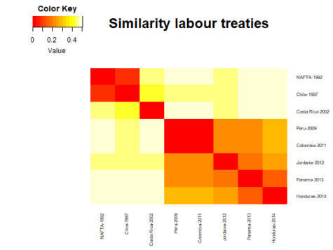
The heatmap is symmetrical, meaning that both axes display the same information and follow the same order. Here the heatmap is ordered chronologically from the earliest labor agreement (NAFTA 1992) to the latest (Honduras 2014). Based on the heatmap, we can identify three generations of Canadian labor agreements. The first is the NAFTA and Chilean treaty, which are both similar. The second one is made up Costa Rica agreement, which differs from all other agreements in our dataset. The third regroups all treaties signed since 2009.
Now we pass on to the more detailed heatmap of the labor treaties represented through their 5-character gram components.
# no dendogram displayed. # column clustering. # row clustering. # heat map title.
heatmap.2(distance_matrix_5gram,
dendrogram='none',

Rowv=FALSE,

Colv=FALSE,

symm = TRUE,

trace='none',

density.info='none',

main = "Similarity labour treaties",

labCol = paste(treaty_texts$treaty_partner,treaty_texts$treaty_year,sep="-" ),

labRow = paste(treaty_texts$treaty_partner,treaty_texts$treaty_year,sep="-" ),

cexRow = 0.6,

cexCol = 0.6)
##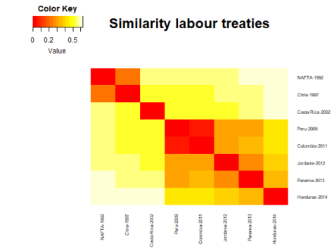
The overarching patterns are similar, but the results allow for a more refined comparison. The three generations still come out clearly, but we see an additional pattern which shows that the Peru and Colombia treaties are extremely similar – more so than any other agreement. In addition, the Honduras treaty, although similar to other agreements signed since 2009, appears more different than the prior heatmap suggested. This could indicate a movement towards a fourth generation of treaties.
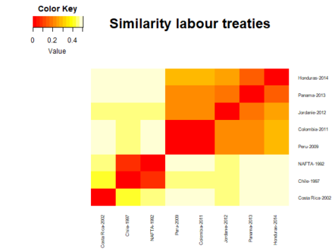
Importantly, our heatmaps have, up to now, been order based on the original dataframe. If we want to order our heatmap by similarity, we need to activate the hierarchical clustering built into the heatmap.2 algorithm.
heatmap.2(distance_matrix,

dendrogram='none',

Rowv=TRUE,

Colv=TRUE,

symm = TRUE,

trace='none',

density.info='none',

main = "Similarity labour treaties",

labCol = paste(treaty_texts$treaty_partner,treaty_texts$treaty_year,sep="-" ),

labRow = paste(treaty_texts$treaty_partner,treaty_texts$treaty_year,sep="-" ),

cexRow = 0.6,

cexCol = 0.6)
##
access_time Last update May 11, 2020.